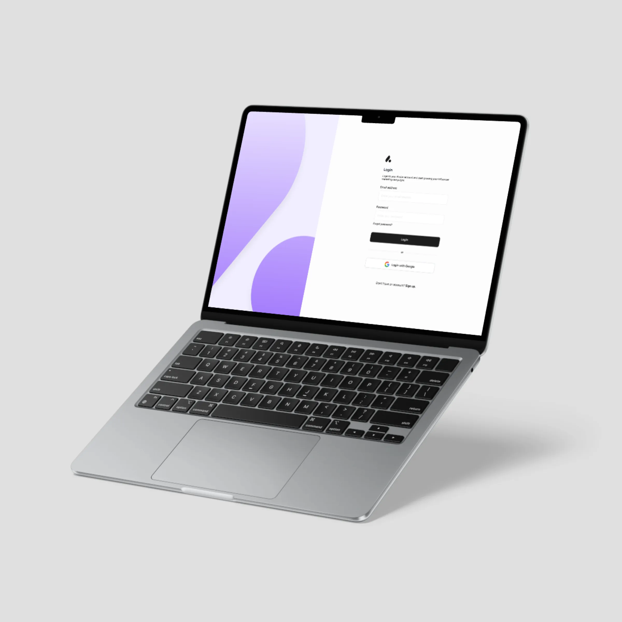
- B2B SaaS
- Sole designer
- 0→1
Avalan – Influencer Marketing Platform
Designed a scalable platform from 0 to 1 to help brands discover influencers, analyze performance, and monitor competitors.
Available
Hey there! I'm Miha. A digital designer specializing in Product, UX and UI design.
How I work
Designer with 5+ years of experience creating platforms, websites, apps, and digital products - taking projects from idea to final product.
Discover my work5+
Years designing digital products
6months
From idea to launched product at Avalan, 0→1
200+
Companies ordering through Zarestaj
40%
Less food waste for companies on Zarestaj
Projects
Highlighted project
Designed a scalable platform from 0 to 1 to help brands discover influencers, analyze performance, and monitor competitors.
More projects
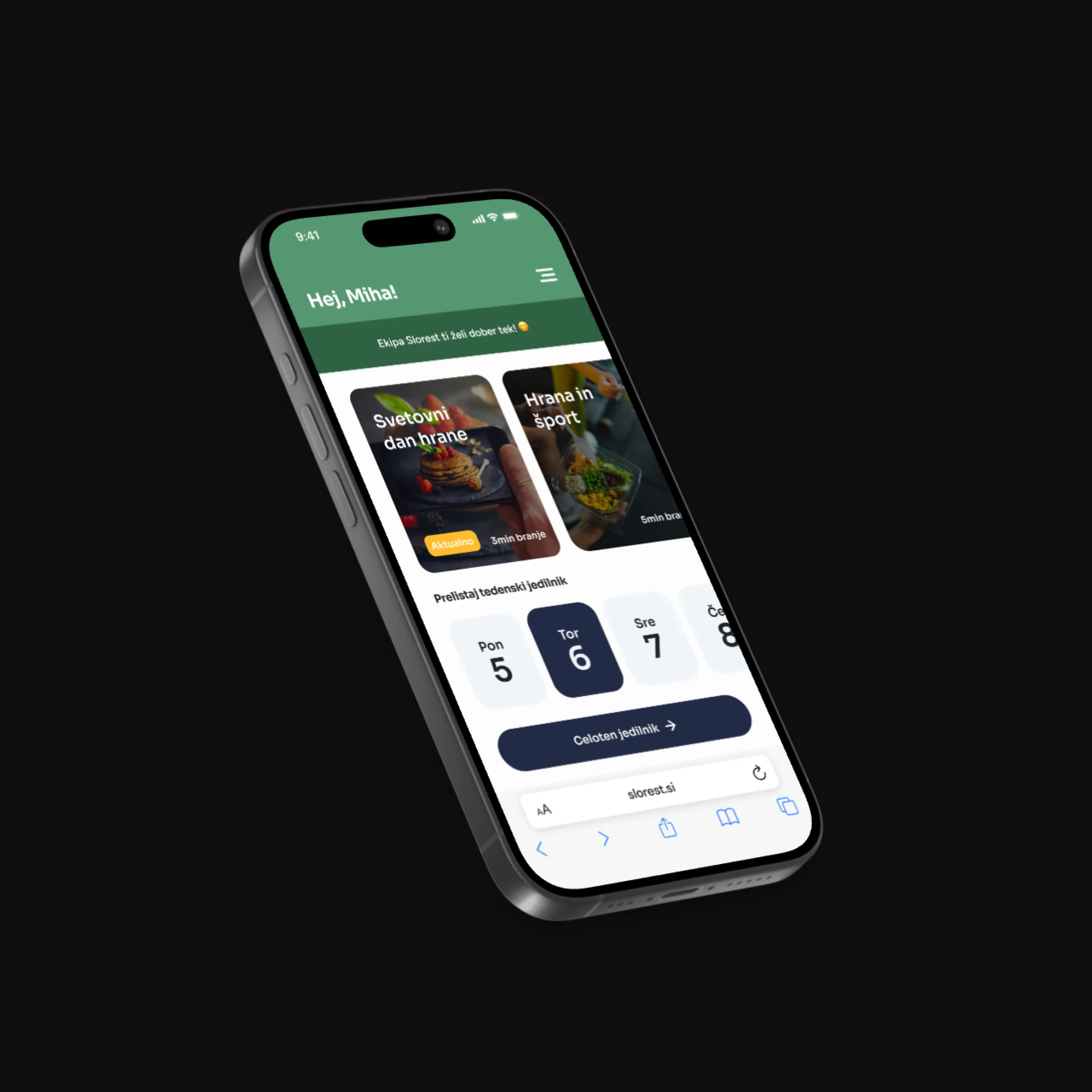
Designed a web and mobile solution for 200+ companies, cutting food ordering time and reducing waste by 40%.
Case study on request
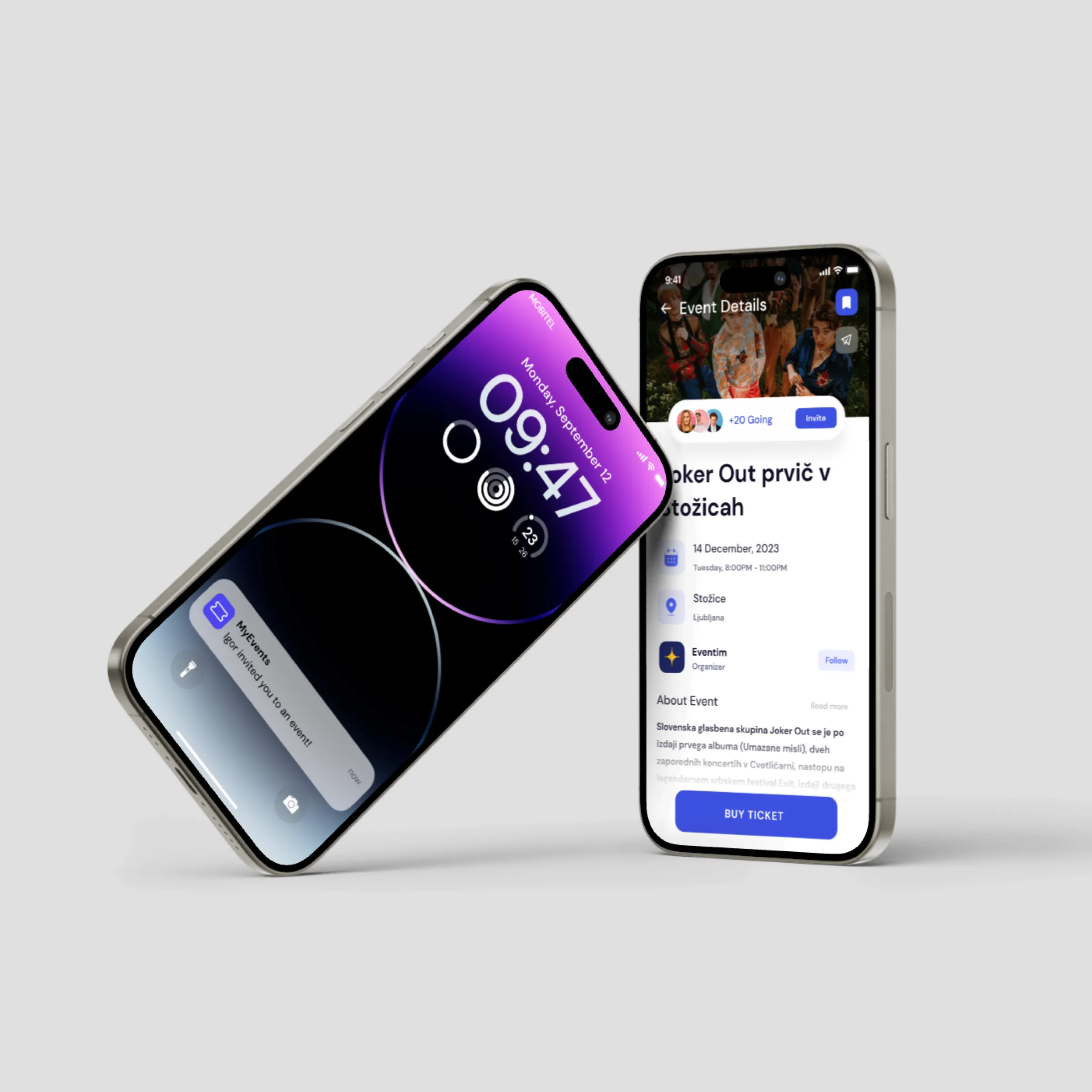
Designed a mobile app enabling users to effortlessly discover, book, and enjoy events, with a faster, more engaging booking flow.
Case study on request

Miha PodpečanProduct Designer
About
Designer with 5+ years of experience creating platforms, websites, apps, and digital products across SaaS, media, and marketing industries. Experienced with Figma, Webflow, and taking projects from idea to final product.
Testimonials
What I value most about Miha is not only his strong visual sense, but also the way he works day to day. He approaches tasks with a clear and practical mindset. He keeps projects easy to follow: stakeholders know what is happening, what is needed from them, and where the work stands. He is direct, hands-on, and always focused on keeping the work structured, efficient, and moving forward.
Miha played a key role in bringing Avalan to life, designing the entire platform from the ground up. He has a strong understanding of user experience, and the ability to turn complex requirements into a polished product.
Some of the projects he took on were design of the landing pages, preparing the content for advertising campaigns, UX/UI design of the dashboard and the app. He worked with the development team as a designer to implement the changes needed. Miha was professional and delivered better than expected results. I was often impressed.
Contact
Case study · Avalan
B2B SaaS · Sole designer · 0→1
Avalan is a B2B SaaS platform that helps brands and agencies run influencer marketing campaigns end-to-end, from creator discovery through to performance analysis and competitor intelligence. I joined as their sole, full-time designer before the product existed in any designed form. Over 14 months, I owned every design decision: research, product strategy, information architecture, UI, design system, and the marketing website.
Context
Working in a startup as the only designer means you don't get a pre-defined brief - you help write it. The founding team had a clear market thesis: influencer marketing was growing fast, but the tooling hadn't kept up. Most agencies were running campaigns out of spreadsheets, Instagram DMs, and disconnected analytics tools, with no single source of truth. My job was to turn that thesis into a product people would actually want to use every day.
The problem
Through conversations with campaign managers, agency leads, and the founding team, alongside a structured audit of existing tools, three problems kept surfacing:
Marketers searched platforms manually and used follower count as a proxy for quality. There was no way to filter by real engagement, audience demographics, or past campaign performance.
Without centralized tracking, managers couldn't see what had been posted, what was overdue, or how a campaign was trending. They found out when a deadline was missed or a client asked.
No systematic way to see which influencers competitors worked with or how those partnerships performed. Benchmarking was guesswork.
These weren't niche pain points. They were structural problems across the industry.
My role
Embedded full-time as the sole designer - not a freelancer brought in for a phase, but a team member in every product conversation, stakeholder decision, and tradeoff.
Competitive audit, stakeholder conversations, and user interviews before a single screen was drawn.
Mapping every feature, task, and data relationship so five modules felt like one product.
Validating navigation and task flows in low fidelity before visual design.
Brand, UI, and a component library the dev team still uses for every new feature.
Designed and built in Webflow; the primary acquisition surface for sign-ups.
Refining flows based on real user behavior, not assumptions.
Research & discovery
Before opening Figma, I spent the first month understanding the space.
Mapped these tools: how they structured their products, where they fell short, and which UI conventions users already knew.
With the founders: which segments first, what success looks like at six months, what's core vs. nice-to-have for v1.
With campaign managers and agency account leads about what they actually did day to day, where they lost time, and what made them trust or distrust a tool.
Users wanted to know what to do next, not more dashboards. The design language surfaces status and next steps, not just raw numbers.
A campaign manager reviewing content and an account director reviewing ROI have different needs. It had to work for both without burying either.
Showing how and where metrics were calculated became a design requirement from day one.
Design process
With five feature areas (discovery, tracking, analytics, collaboration, competitor intelligence), the biggest risk was a product that felt like five disconnected tools. I mapped every feature, task, and data relationship before touching a screen - giving the team a shared model and making v1 prioritization clear.
Influencer search, campaign setup, and the analytics dashboard went through several rounds of low-fidelity review with the founders and were refined against user feedback before high fidelity.
A professional, data-driven visual language with clear typography and balanced white space, refined through usability testing and iteration.
Key decisions
Separate discovery/analytics/content sections would make users lose context every time they navigated. I made the campaign the central hub - every influencer, content piece, and metric anchored to one campaign view. This reduced navigation depth and made status visible without digging.
Progressive disclosure: summary cards at the top level, detail on demand. A consistent grid, clear type hierarchy, and deliberate use of colour separate signal from noise.
Instead of a bare approve/reject toggle, the review state shows content alongside the campaign brief, the influencer's profile, and performance history - so decisions happen without leaving the platform. This cut back-and-forth with influencers and gave agency clients an audit-ready workflow.
The solution
Filter by niche, audience demographics, engagement rate, and past campaign performance. Hours of cross-platform searching become a single filtered query.
See what's live, pending, or overdue across every influencer. Approve content with the brief alongside it, not across email threads.
Influencer-, content-, and campaign-level analytics show why performance happened, plus which creators rivals use and how those partnerships perform.
Outcome
Launched to first clients after 6 months of design and development.
The Webflow marketing site remains the primary conversion surface and runs post-launch without design intervention.
The design system is still in active use - every new feature starts from a documented foundation.
Retrospective
No 0-to-1 product is ever finished - it ships when it's good enough to learn from.
Formalise research earlier. Startup pace meant some research ran in parallel with wireframing; a few flows needed extra iteration because assumptions weren't challenged soon enough.
Standardise the design system sooner. Building it iteratively was pragmatic, but earlier standardisation would have reduced late-stage inconsistency and sped up handoff.
Invest more in onboarding. First-time users, especially those migrating from spreadsheets, needed more scaffolding to build the right mental model in session one.
Working with Miha was a great experience. He is efficient, precise, and truly understands how to turn ideas into results. Miha was responsible for the entire appearance of Avalan.io, our influencer marketing tool. He made a huge impact on both its design and user experience. A great thing about Miha is his mindset: while others focus on why something might be difficult, he focuses on finding solutions and always finds a way to make things happen.